
티스토리 뷰
반응형
1) position:fixed;
브라우저(뷰포트)를 기준으로 배치
1. absolute로 고정
html
<div class="grand-parent">
  <div class="parent">
    <div class="child">1</div>
    <div class="child absolute">2</div>
    <div class="child">3</div>
  </div>
</div>
css
body{
  height: 4000px;
}
.grand-parent {
  width: 400px;
  height: 300px;
  padding: 30px 100px 100px 30px;
  border: 4px dashed lightgray;
}
.parent {
  width: 400px;
  height: 300px;
  border: 4px dashed gray;
}
.child {
  width: 120px;
  height: 80px;
  background: tomato;
  border: 4px dashed red;
  border-radius: 10px;
  font-size: 30px;
  display: flex;
  justify-content: center;
  align-items: center;
}
.absolute {
  position: absolute;
  bottom: 50px;
  right: 10px;
}
출력결과
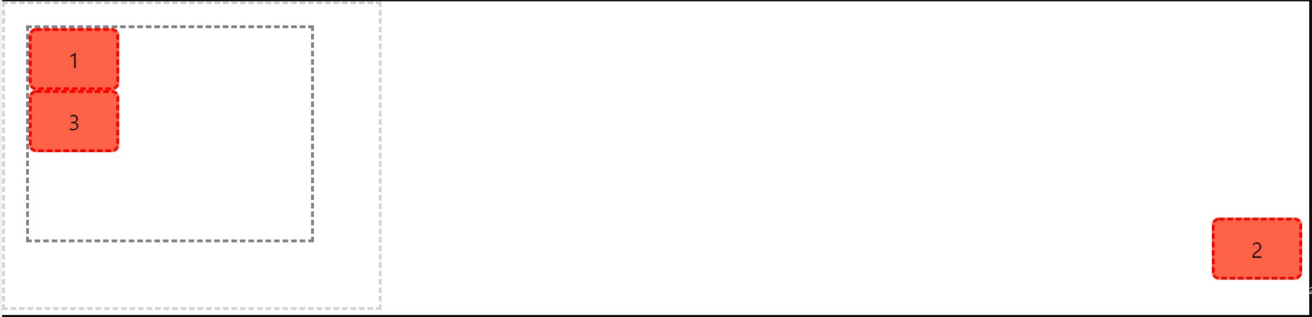
※ absolute를 이용해서 2번 박스를 고정시킬 수도 있지만 창이 움직이거나 길이가 변한다면 영향을 받게 된다.
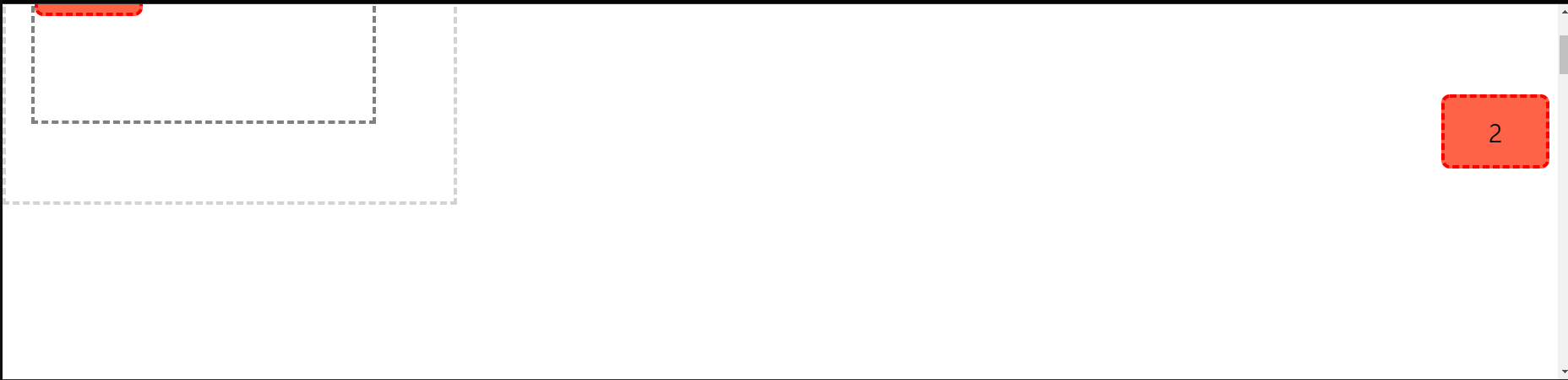
2. fixed로 고정
html
<div class="grand-parent">
  <div class="parent">
    <div class="child">1</div>
    <div class="child fixed">2</div>
    <div class="child">3</div>
  </div>
</div>
css
body{
  height: 4000px;
}
.grand-parent {
  width: 400px;
  height: 300px;
  padding: 30px 100px 100px 30px;
  border: 4px dashed lightgray;
}
.parent {
  width: 400px;
  height: 300px;
  border: 4px dashed gray;
}
.child {
  width: 120px;
  height: 80px;
  background: tomato;
  border: 4px dashed red;
  border-radius: 10px;
  font-size: 30px;
  display: flex;
  justify-content: center;
  align-items: center;
}
.fixed {
  position: fixed;
  bottom: 50px;
  right: 10px;
}
출력결과

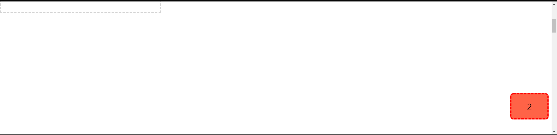
※ fixed를 이용할 경우 2번 박스는 항상 뷰포트를 기준으로 고정되어 있고 창이 움직이더라도 영향을 받지 않는다. 보통 상단의 우측 상단의 박스나 메뉴 같은 부분을 만들때 적용한다.
반응형
'HTML CSS JS' 카테고리의 다른 글
| CSS) position 특징 - 요소 쌓임 순서 (0) | 2021.08.31 |
|---|---|
| CSS) position: sticky; (0) | 2021.08.31 |
| CSS) position: absolute; (0) | 2021.08.30 |
| CSS) position: relative; (0) | 2021.08.30 |
| CSS) position, top, bottom, left, right (0) | 2021.08.30 |
댓글
공지사항